Adding Forums and Sector History
Forums
The forums are back. I promise not to take them away like I did 5 years ago mainly due to time limitations. There is some good discussions and info in them. Funny in a strange and sad way that some topics are timely again (there was a government shutdown in 2013 too.)
You can access the forums from the top menu bar. Note – they are for members only who are signed in, so please join and contribute to the community. I’ll do my best to be responsive to your posts and questions, but this time I’m going to rely more on other Dividend Geek members to help out. Don’t be shy to chime in and give your input. Now that Dividend Growth Investing has be around another 5 years and has an ever growing following of ardent investors. (Prudent investors who have seen the wisdom in long-term investing for income and not trading in and out trying to time the market for capital gains oh and losses.) There will now be a larger group of skilled and experienced members to draw upon for valuable and timely input, or just to bounce ideas off of a sounding board of like-minded investors.
I hope that they are fun and enlightening. One thing that I have learned about investing and ‘FIRE’ (financial independence retire early) is that there’s no limit to what can be learned, it is fascinating journey.
Sector History
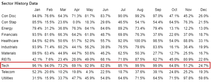
A new member recently emailed me inquiring if the Sector Watch page had past history on the movement of the sectors, so I tracked down the data and put together one year of sector history for the 52 week high/low range percentage. I believe it will give you more context as to the past trend of each of the eleven sectors. For example, Technology had been the leading sector for most of 2018 until early October when they dropped out of favor. The NASDAQ went from 8100 to 6200 from early October to around Christmas a 23.5% pull back. In general when I look for my next dividend growth stock to invest in I first look at which sectors are out of favor. Meaning that they are trading in the bottom range of their 52 week high/low range. This is why the Sectors on the Sector Watch page are sorted by lowest to highest percentage for the 52 week high/low range, with the lowest at the top. Then I like to look at my portfolio and see which sectors I have the lowest weighting in (percentage of ownership in those sectors) to see if there is a good match. Of course this is just a starting point as you then drill into the value and quality of individual stocks within those industries, but it helps me to keep in mind sector diversification of my portfolio, and starting off where there is likely a better discount to fair value when drilling into the individual companies.
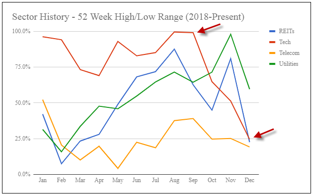
The difficultly is displaying all of the data so it’s readable and meaningful. When I put all eleven sectors into one line chart it was so busy I couldn’t even follow the lines half way through the year. I tried a few combinations and found that four lines (sectors) was easy to read and understand, so I went with three separate charts to display the eleven sectors. If you have other ideas on how to best display this data I’m open to suggestions. I’ll add subsequent months when we get to the end of each month. Overtime the data should be more meaningful, and possibly bring out the ebb and flow of sector rotation (business cycle).
![]()
Filed in: Dividend Growth Investing • Website Tools
Subscribe
If you enjoyed this article, subscribe to receive more just like it.


